Explorar las categorías
Explora
Fiverr Pro
Español
$
USD



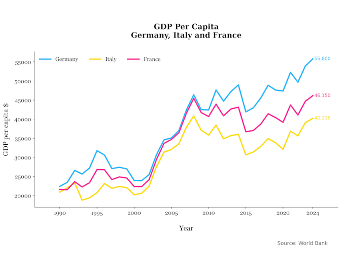
I will create stunning data visualizations and charts using Python from your Excel, CSV, or SQL data.
Get high-resolution visuals in .pdf, .png, .jpg, .jpeg, .eps, .ps, or .svg, ready to use in Word, PowerPoint, or any graphic software.
Charts I can create:
Dont know which chart is best for your project? No problem! I'll help you choose. You can also customize fonts, colors, and sizes according to your preference.
Kindly contact me before placing an order to discuss your project.
Data Analyst, Data Visualization Expert, Python Programmer
Idiomas
What data formats do you accept?
I can work with Excel (.xlsx, .xls), CSV, and SQL.
In which format will you provide the visualizations?
Get high-resolution visuals in .pdf, .png, .jpg, .jpeg, .eps, .ps, or .svg, ready to use in Word, PowerPoint, or any graphic software.